A geometric rebirth: transforming visual identity to compete in the global market
Pooward
A brand design project supporting the international evolution of a leader in industrial automation.
- Skills
- Marketing analysis
- Strategic branding
- Services
- Analysis and insight research
- Brand identity
- Visual identity
- Year
- 2025 - Ongoing
A brand design project supporting the international evolution of a leader in industrial automation.
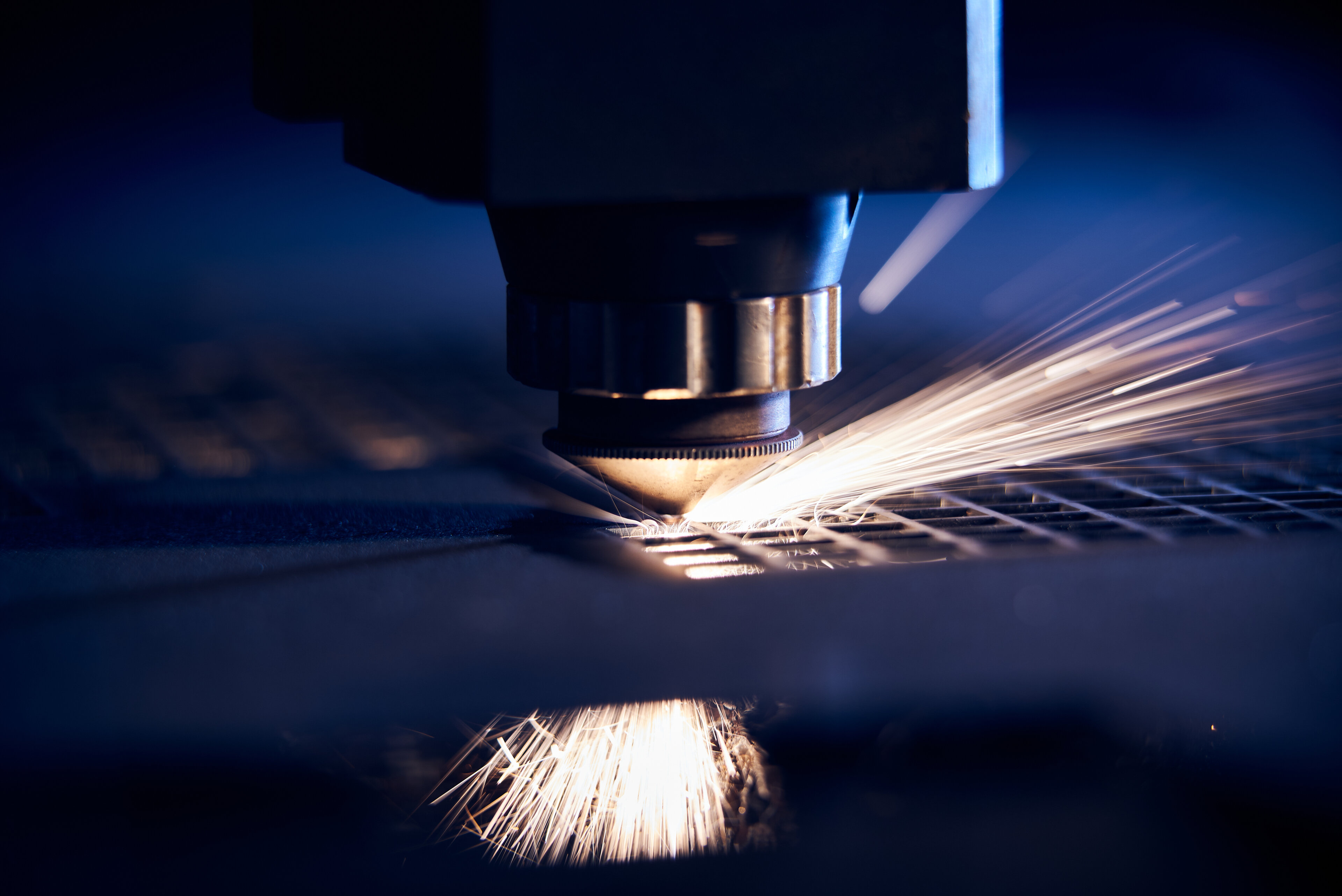
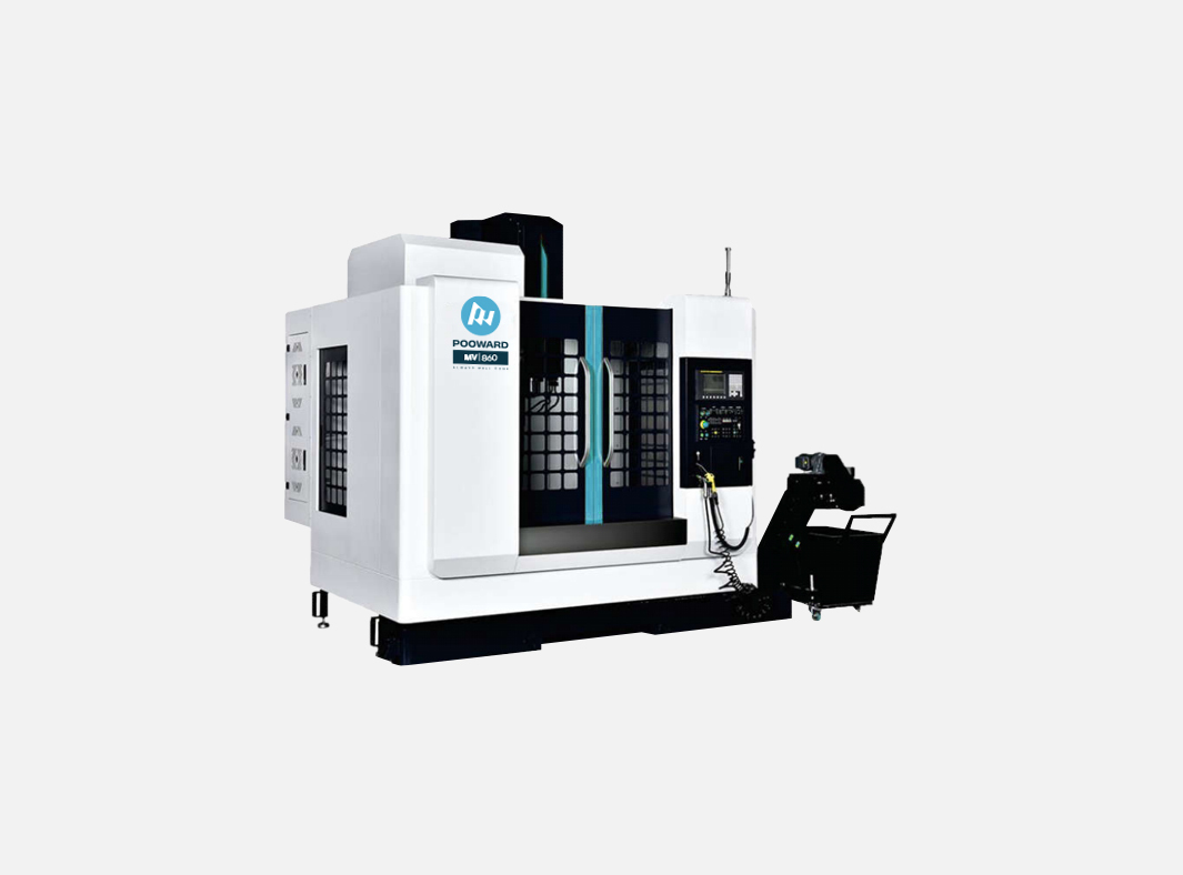
Pooward is a major Chinese company headquartered in Dongguan, with over 300 employees and a leading position in the industrial automation sector. As part of a strategic development phase and a progressive strengthening of its presence in international markets, Pooward identified the need to rethink its visual identity, making it stronger, more contemporary, and aligned with the high level of technological excellence it has achieved.
Zaki was selected to support this journey through the design of a new logo and the development of a new brand identity, with the aim of fostering the company’s growth and making the Pooward brand more recognizable and competitive on a global scale.
The challenge
Cultural differences, regulations governing digital communication, and the dynamics related to trademark registration are not obstacles when working with a well-structured agency capable of managing complexity and turning it into a clear, secure, and effective process. The goal was to develop a visual system that was at once solid, dynamic, and legible, capable of conveying not only the company’s identity and values on an international scale, but also the scientific rigor and precision of the technological solutions it provides.
The main challenges included:
- translating technological and industrial values into a clear and distinctive visual language, consistent with the brand’s global positioning;
- overcoming cultural and symbolic barriers in visual and digital communication;
- ensuring applicability across multiple touchpoints, from corporate materials and online communication to physical and architectural environments.
The solutions
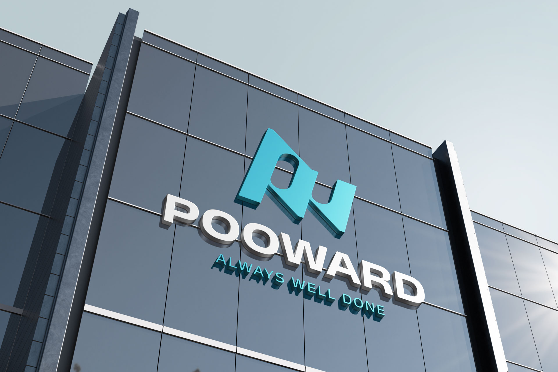
To address this complexity, the project took shape through a reflection on the concept of movement and continuous transformation, structural elements of the industrial world and, in particular, automation.
The central element is the diamond, a symbol of dynamic balance, energy, and change: a shape that communicates stability without stillness, able to represent a company in constant evolution. The triangle, integrated into the composition, reinforces the idea of momentum toward innovation and technological progress, helping to define a mark that conveys vitality and movement while maintaining precision and formal control.
The different geometries also evoke, in an abstract yet coherent way, industrial processes such as milling, turning, and forging, making the brand deeply aligned with Pooward’s core business and its manufacturing dimension.
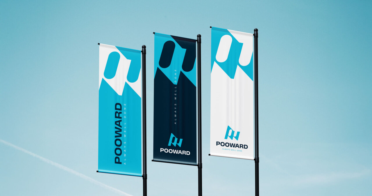
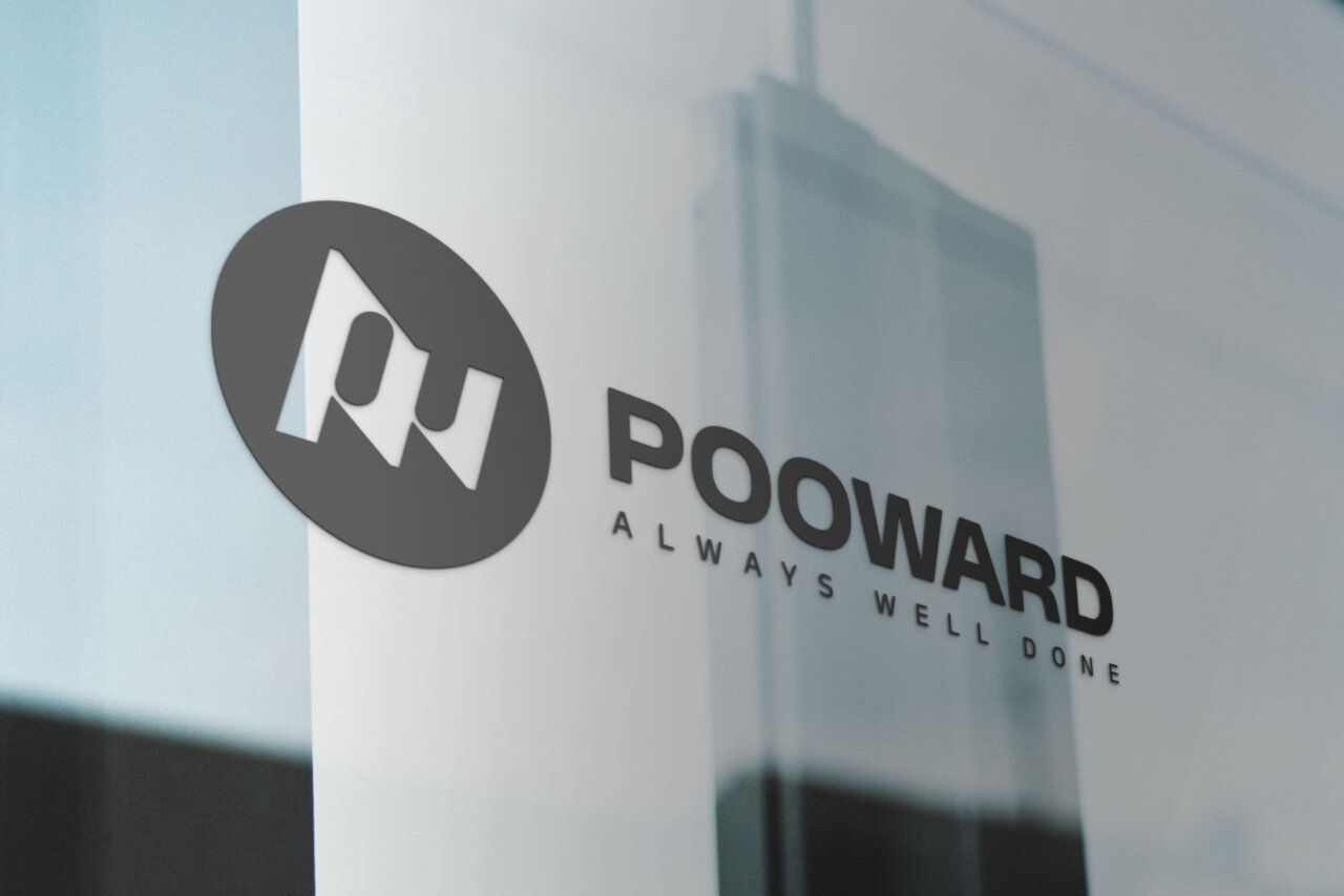
The visual system
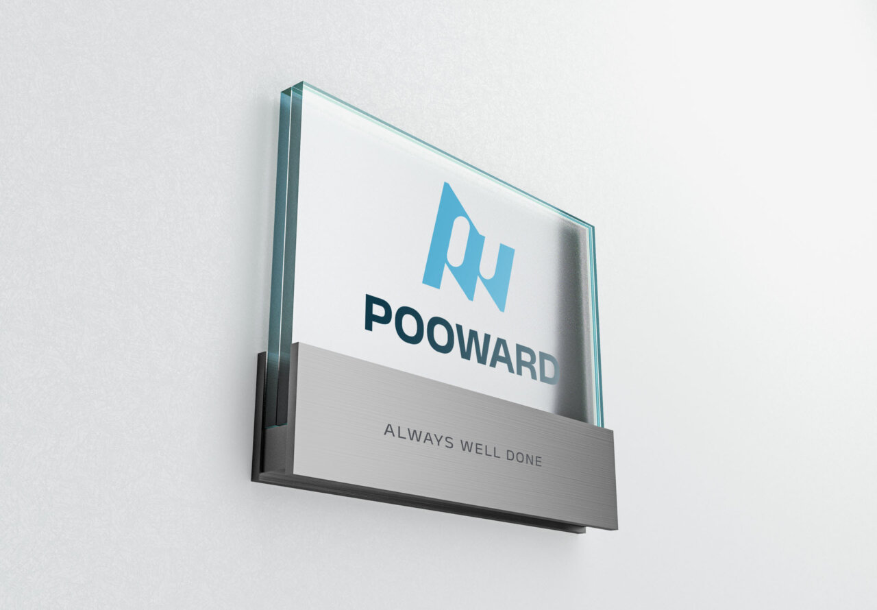
Logo
The mark was designed as the core element of a broader visual system, developed to ensure maximum legibility, application flexibility, and expressive continuity. Its geometric construction, proportions, and usage rules allow the mark to perform effectively across all touchpoints—from digital to physical environments—while always maintaining consistency and recognizability.
Color
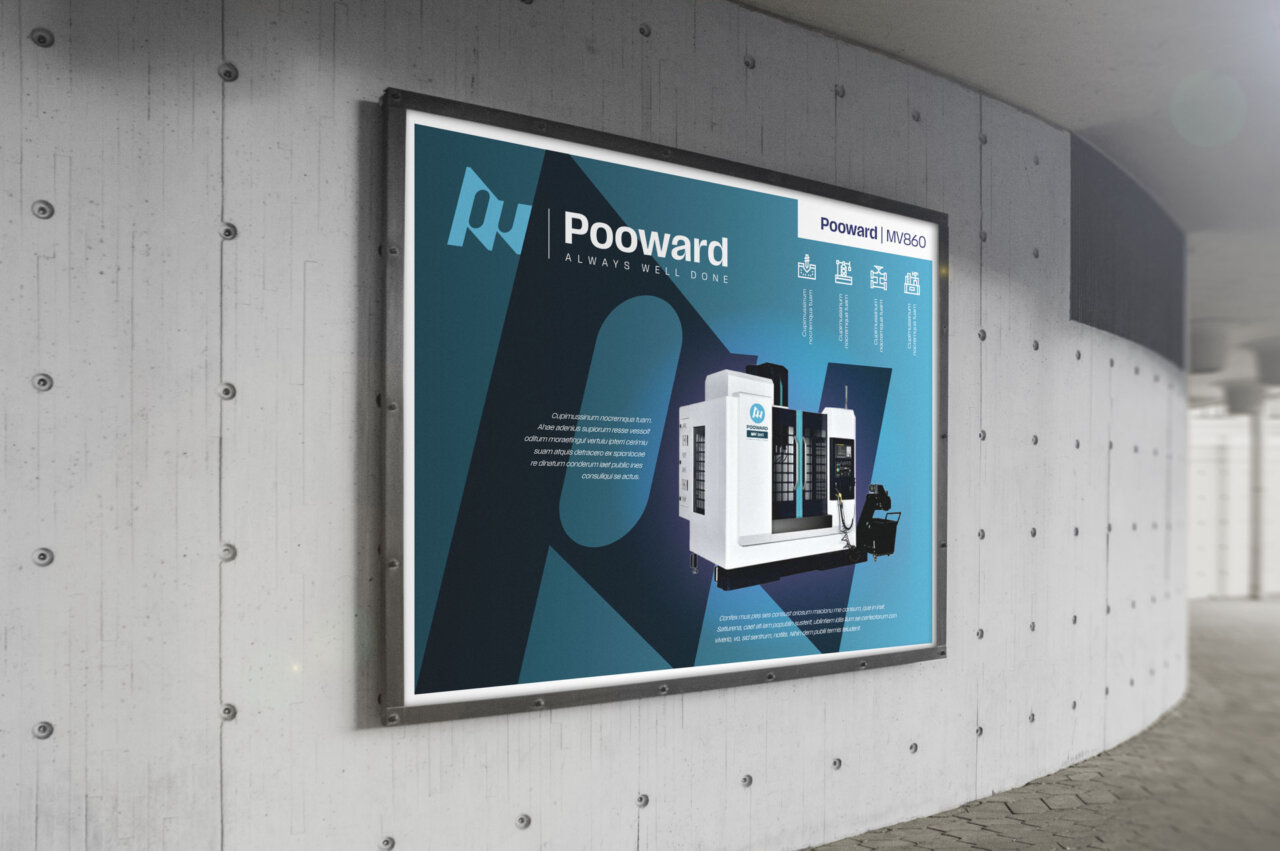
The color choices are based on bold yet fresh contrasts, highlighting Pooward’s ability to combine solidity with progress. Color thus becomes a design tool in support of the identity, strengthening the brand’s presence and supporting its various applications across complex industrial and corporate contexts.
- Energetic accent colors to communicate dynamism
- Dark and neutral tones for solidity and authority
- Gradients designed for digital applications and complex environments
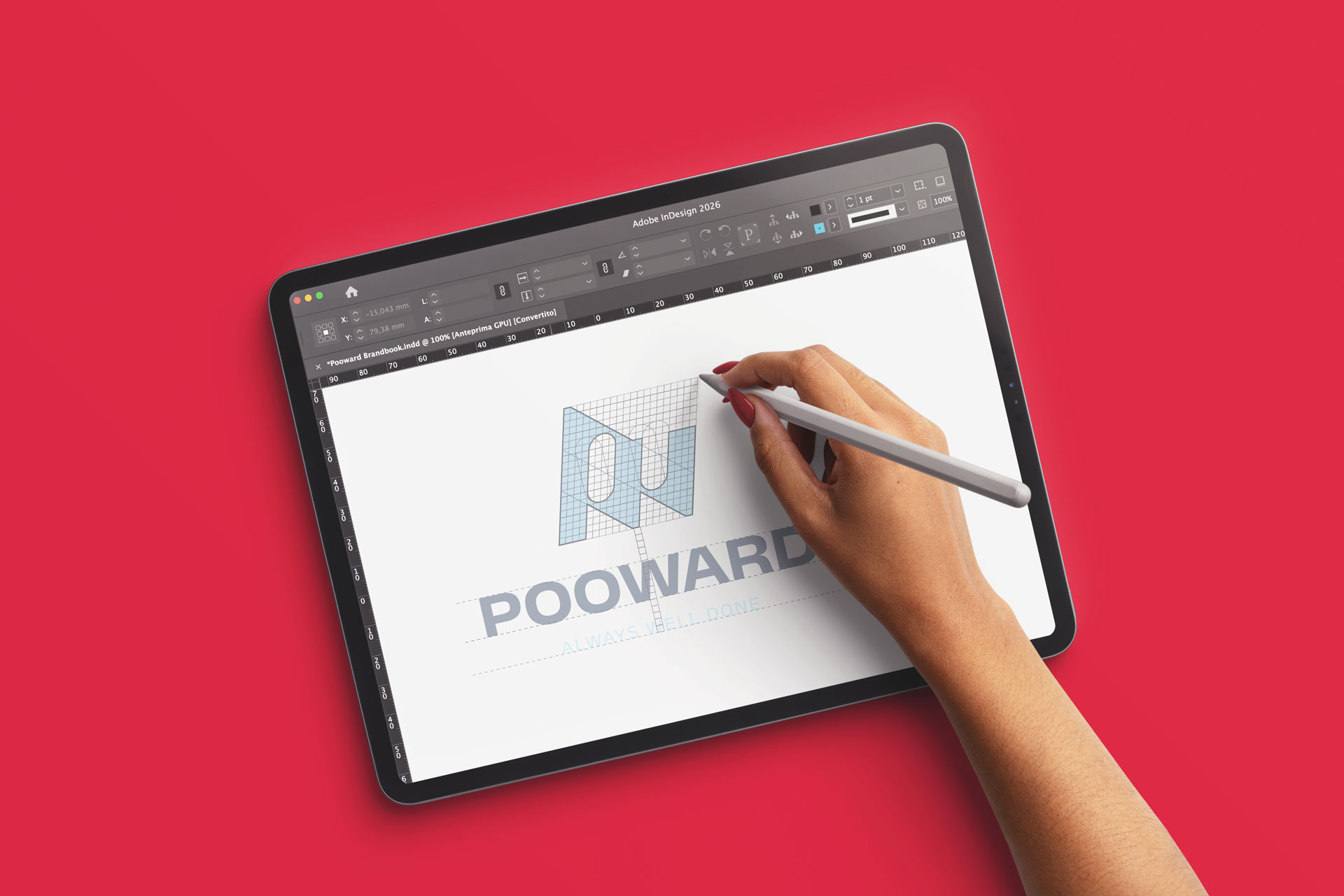
Typography
The typographic choice fell on Anek, a highly modern Open Source variable font, selected for its flexibility and its ability to adapt to different linguistic and application contexts. Anek offers broad modulation across weights and widths, ensuring excellent legibility even in technical and multilingual settings, and a measured balance between personality and functional neutrality.
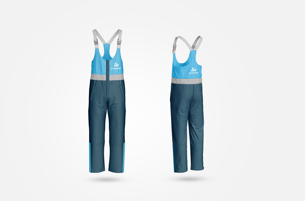
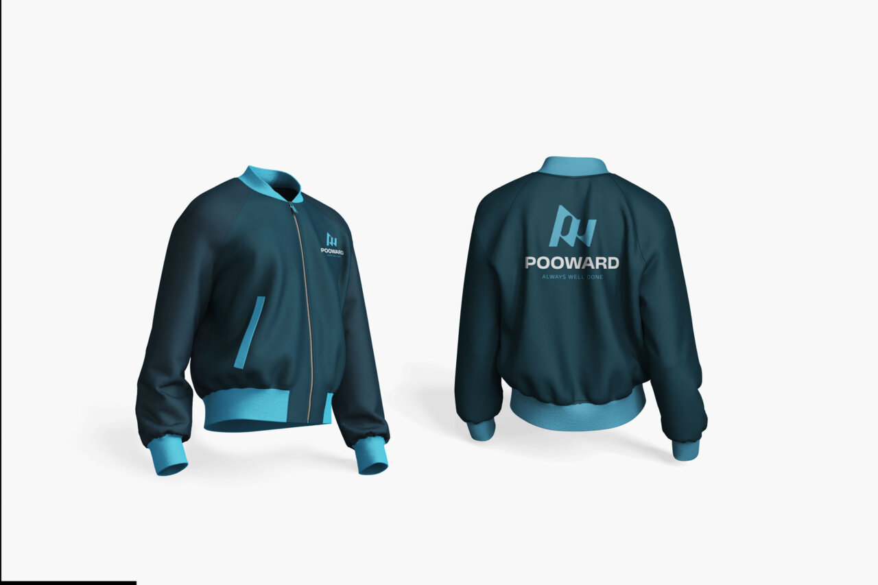
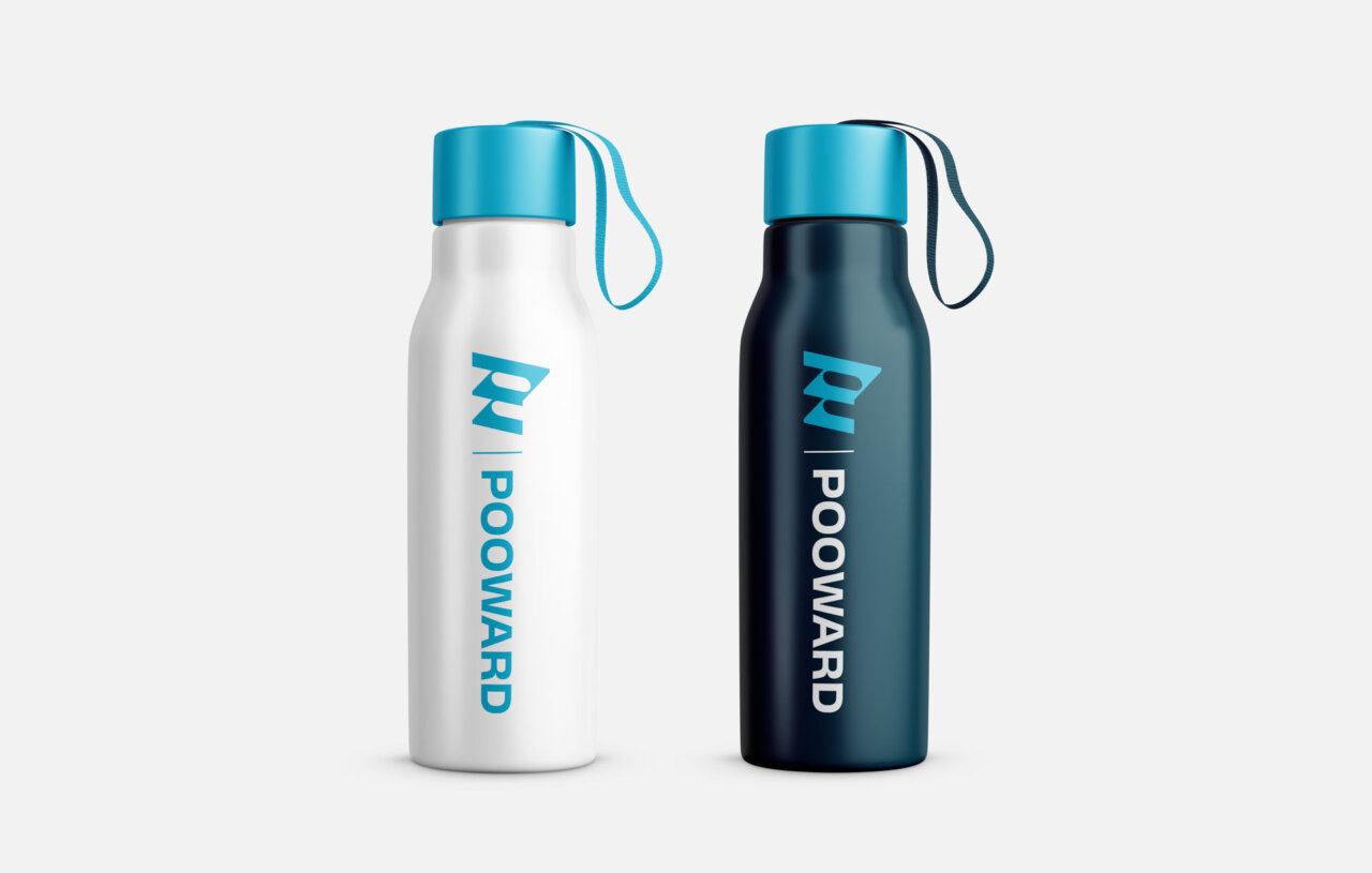
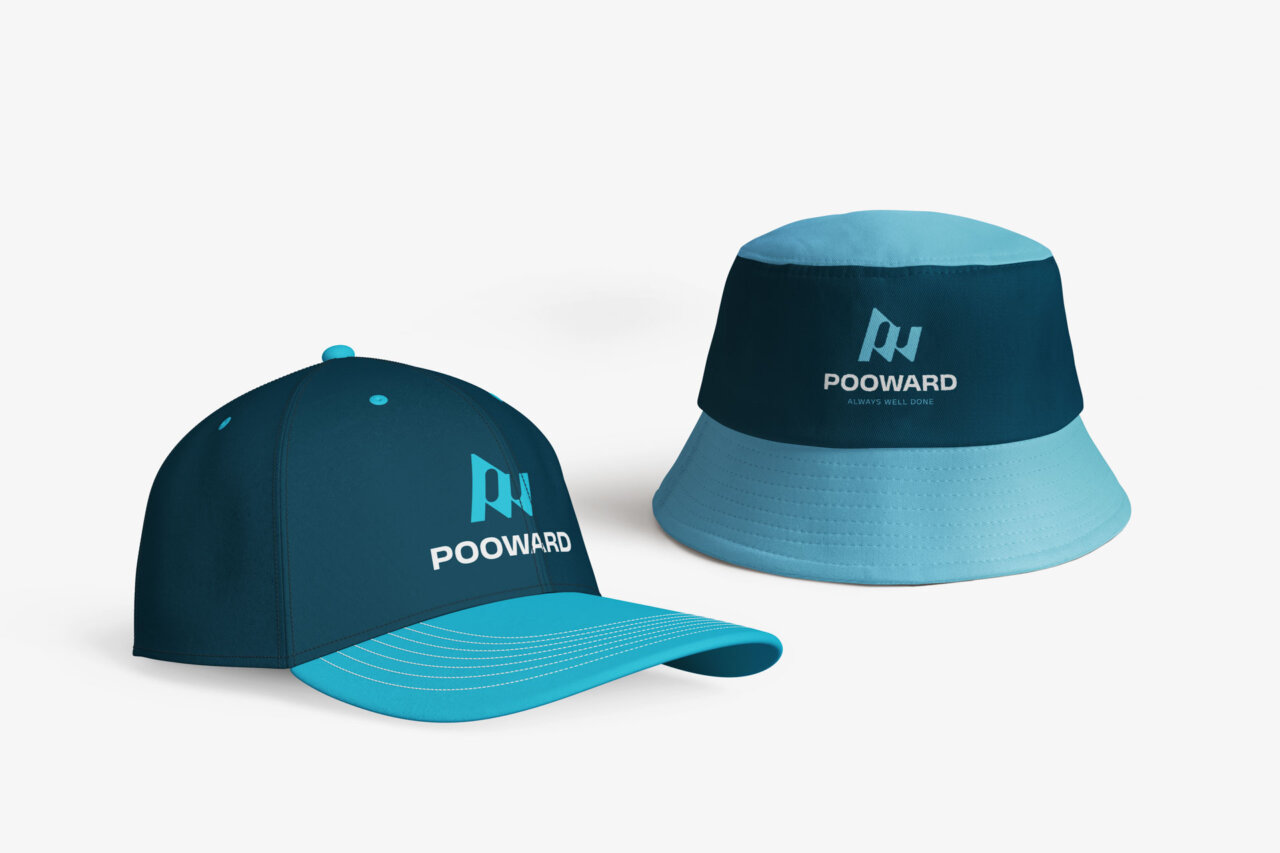
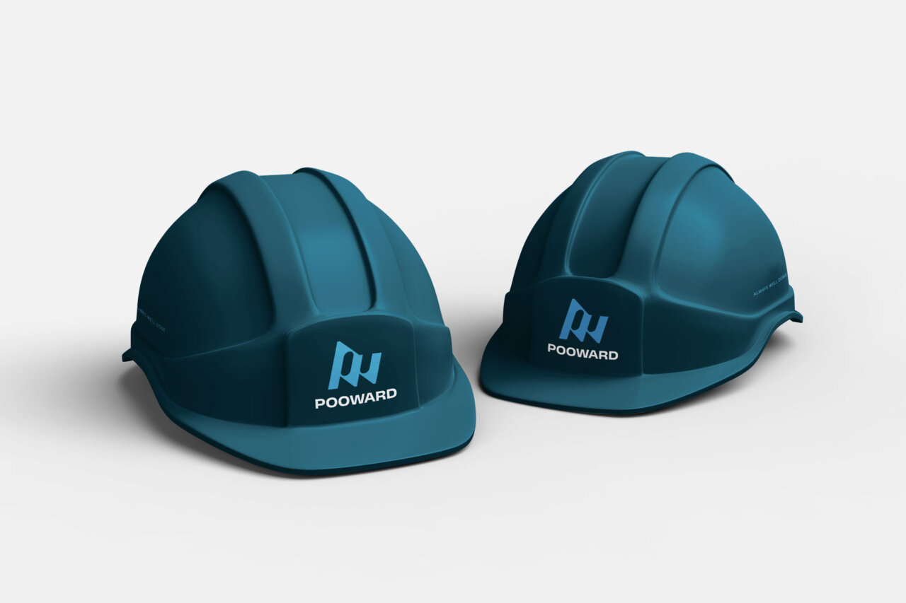
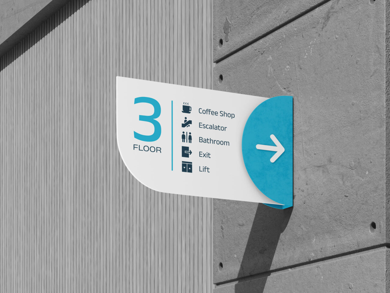
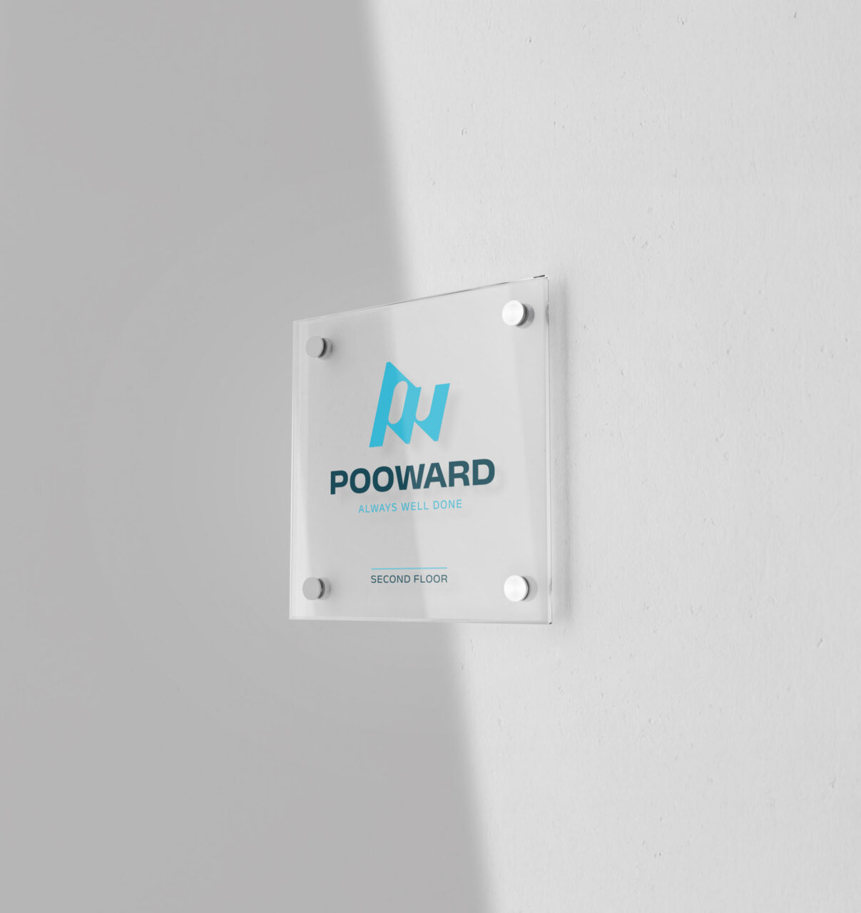
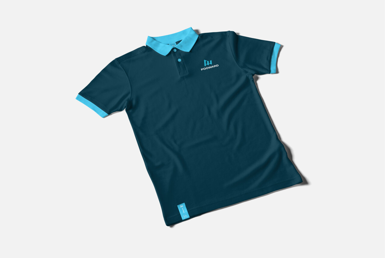
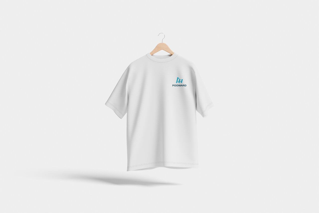
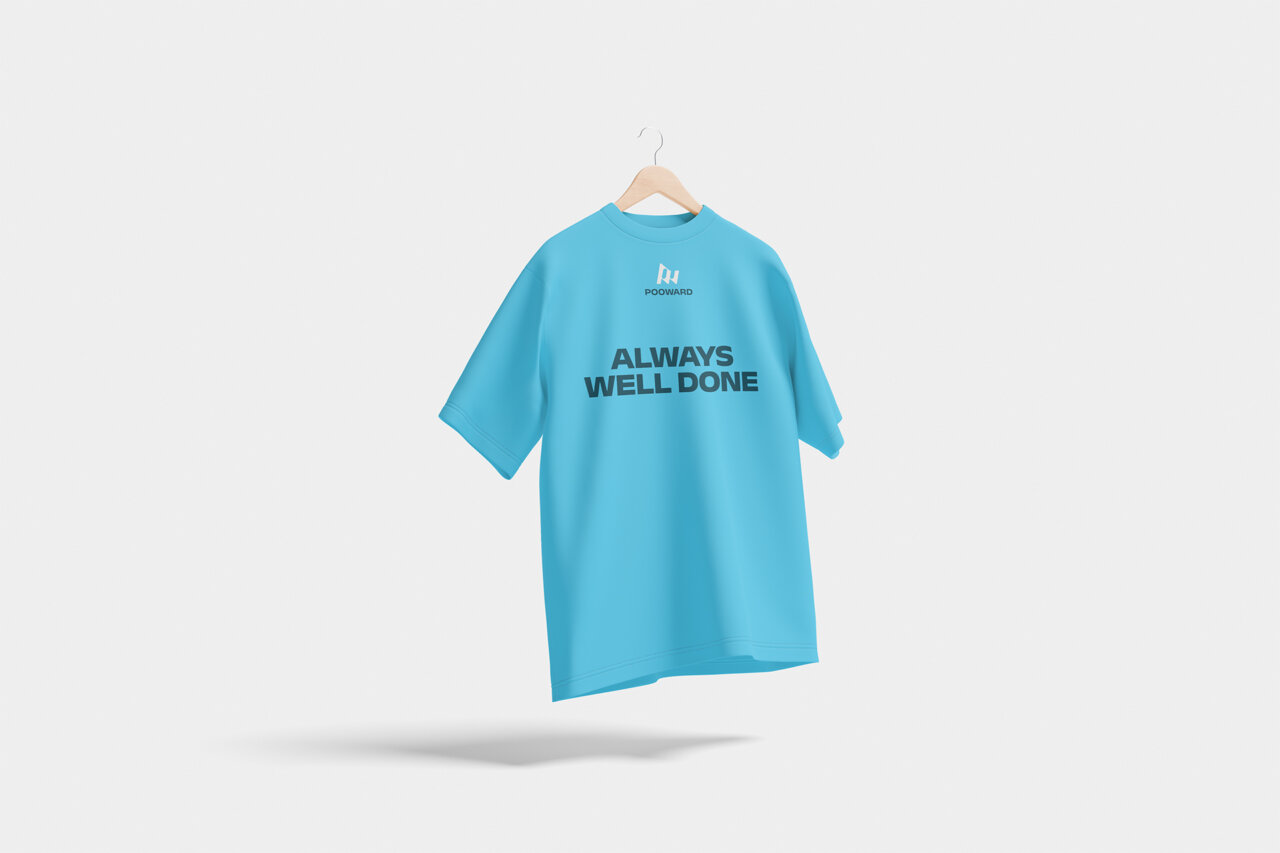
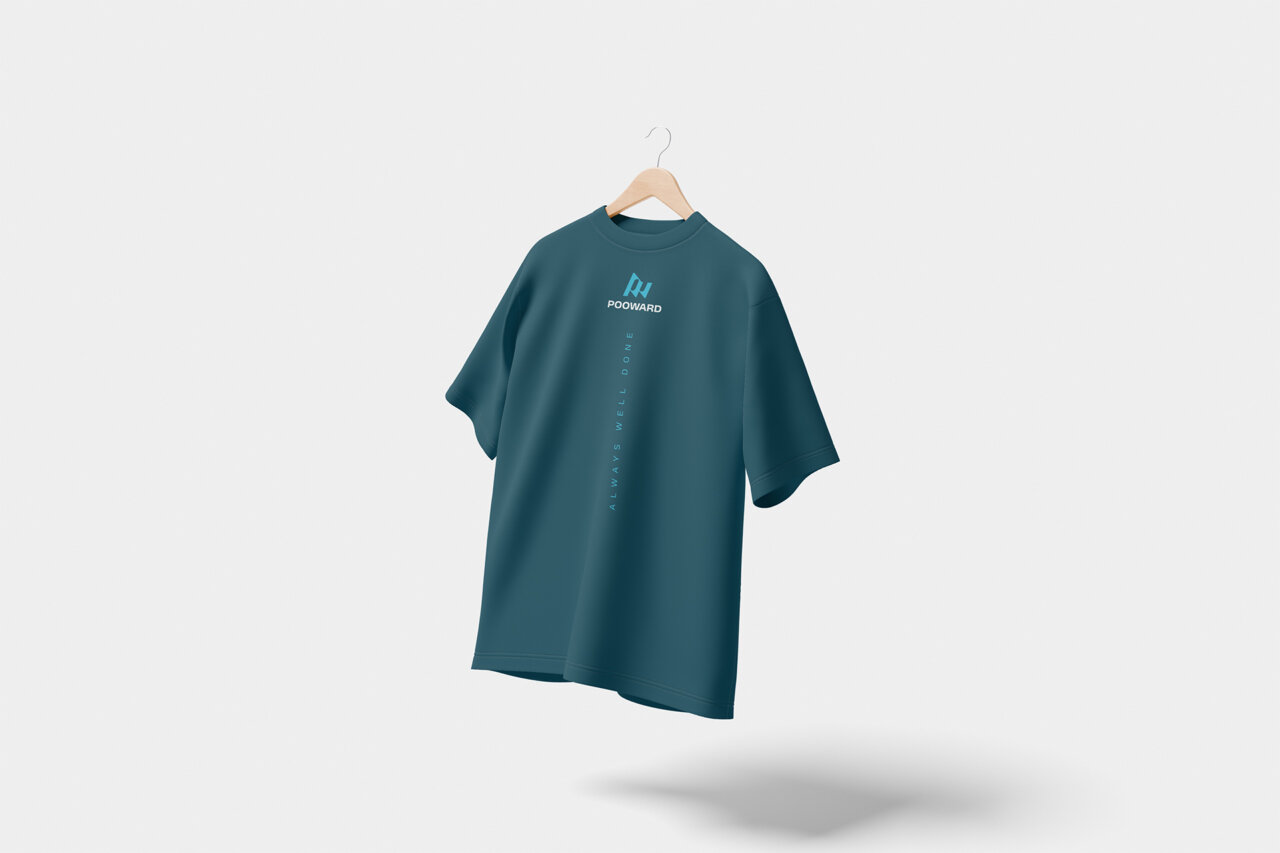
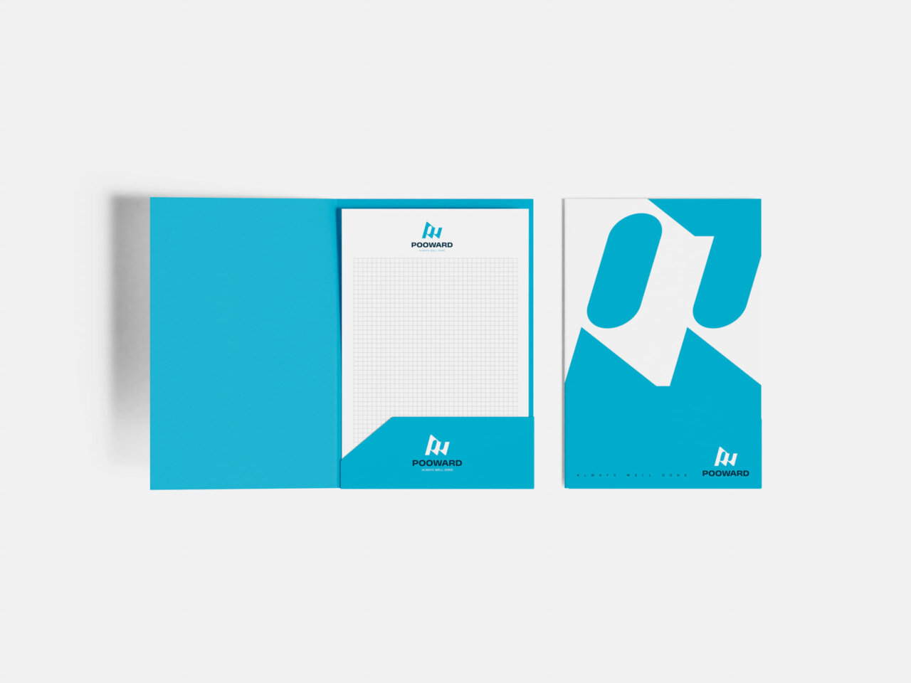
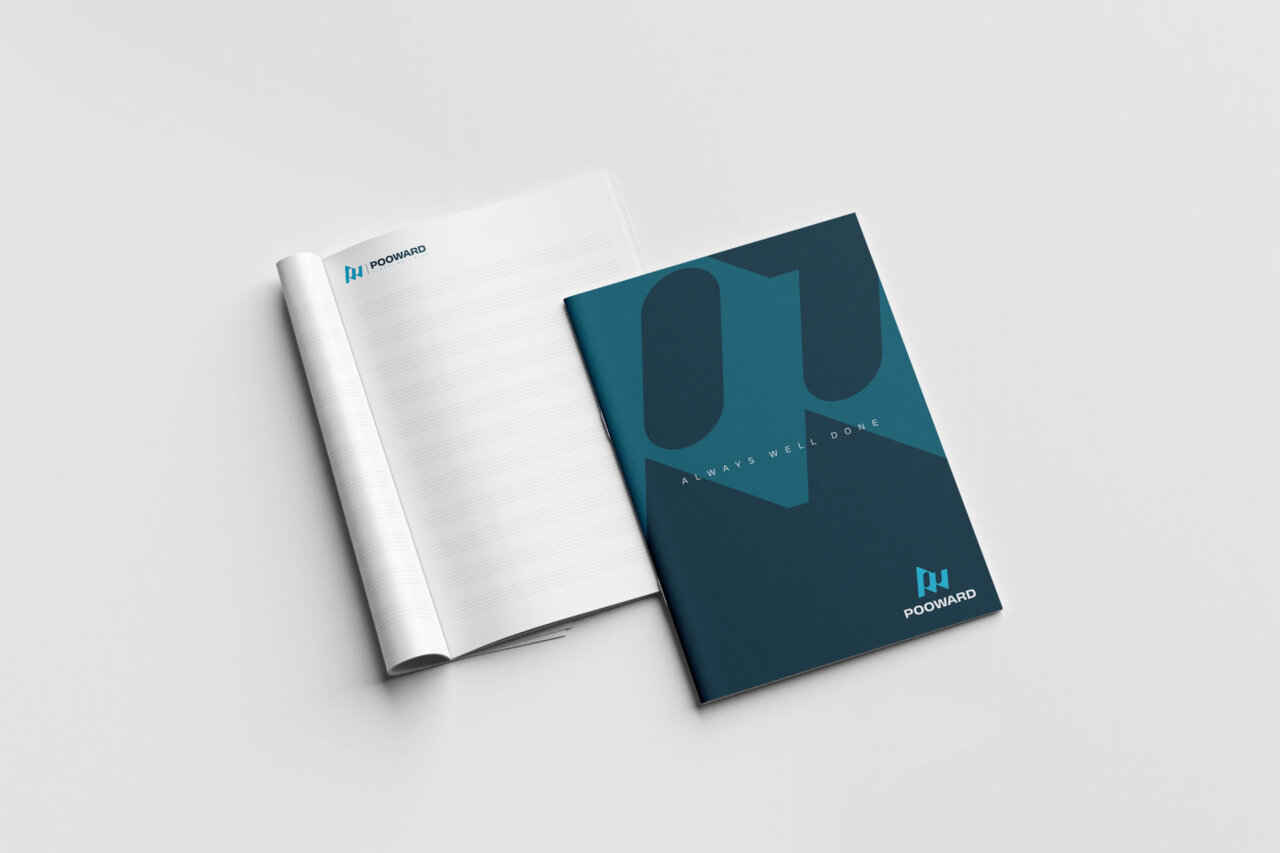
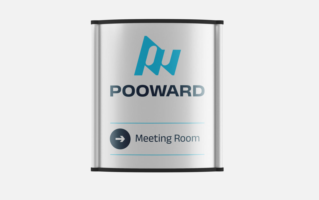
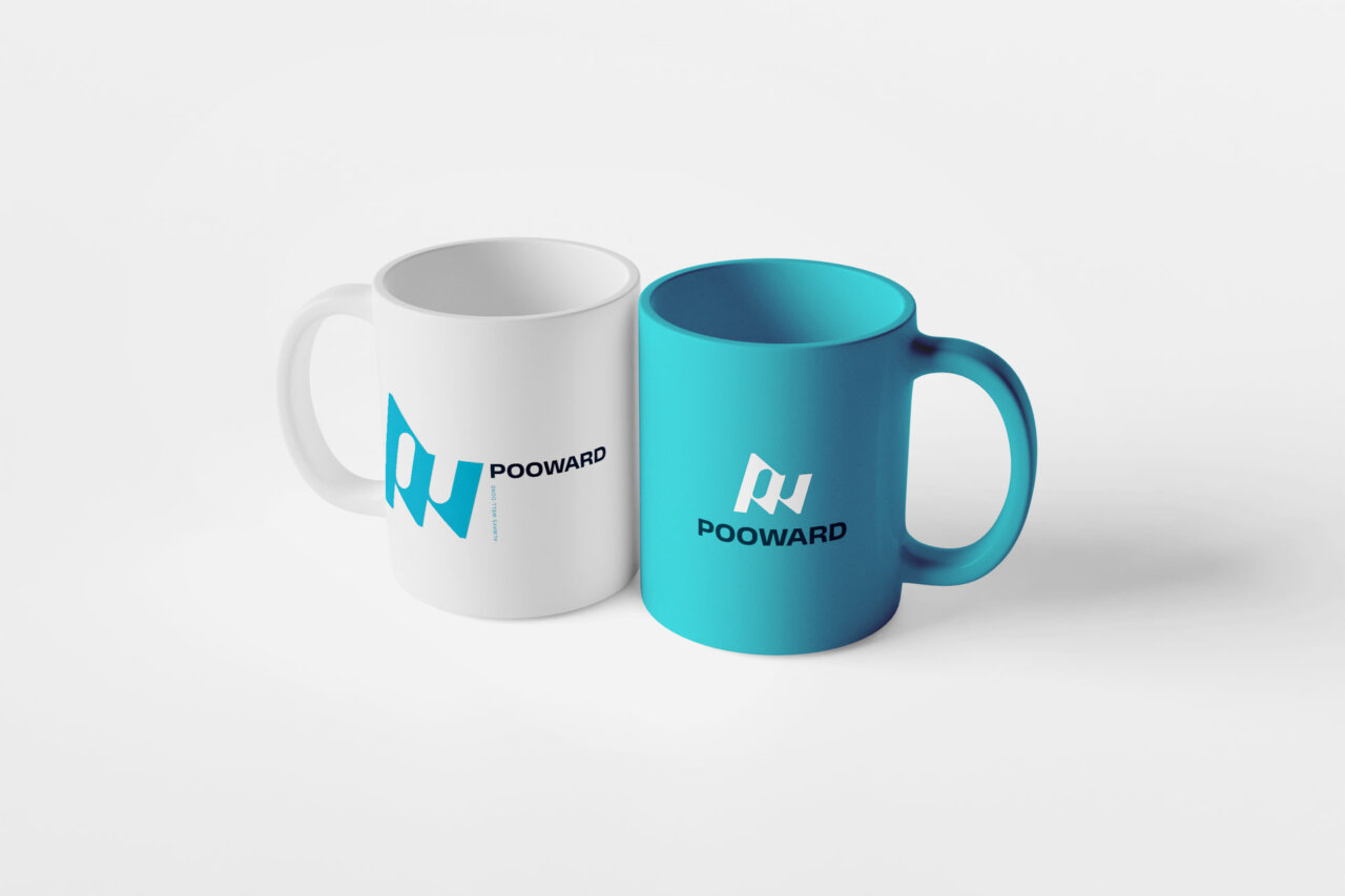
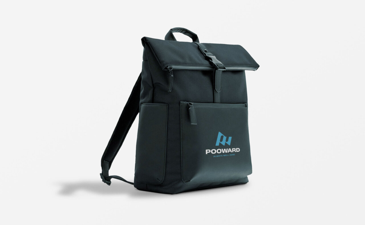
Applications
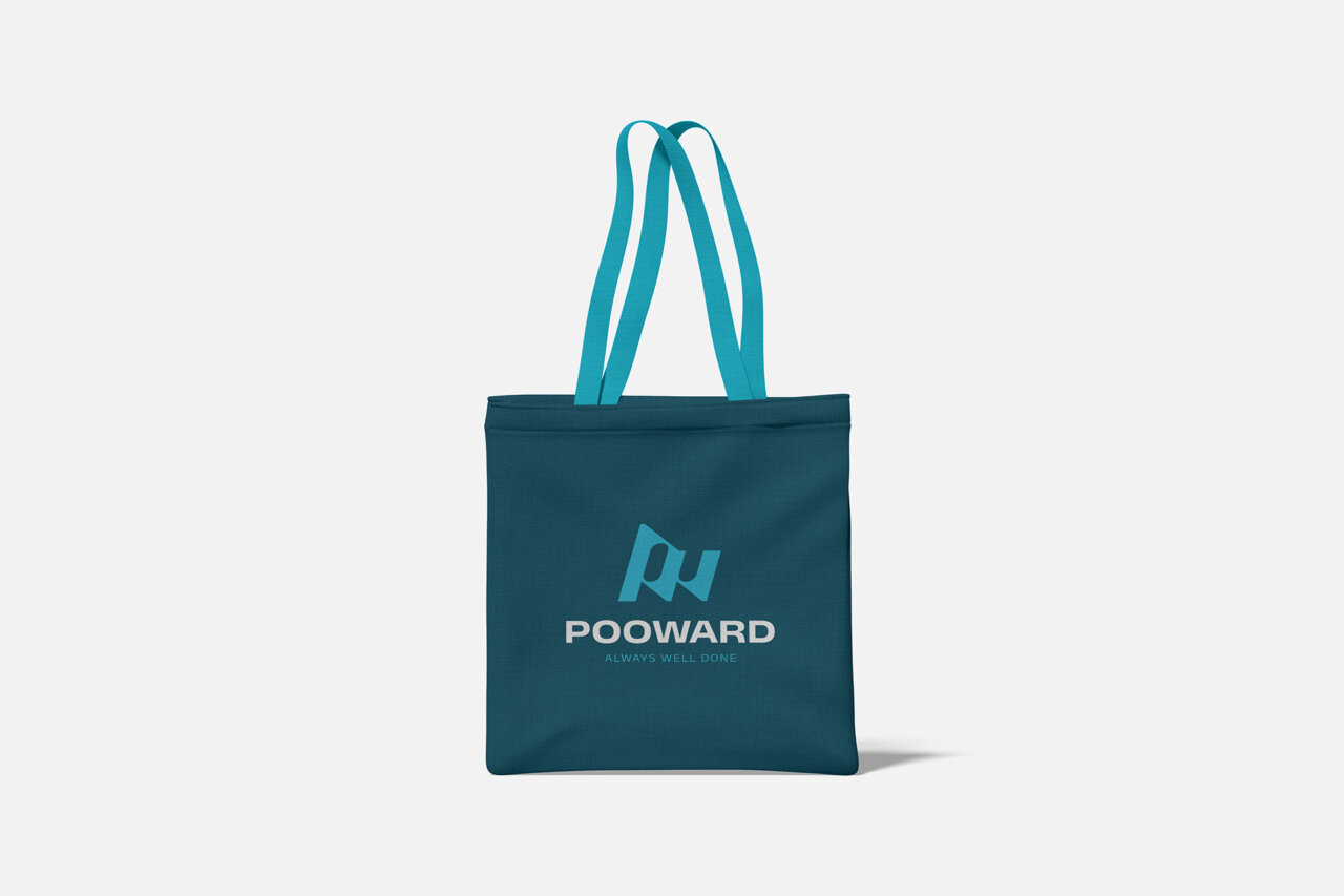
Of course, beyond the complete logo redesign, the project involved the development of the entire coordinated brand image, including the many corporate applications a large company typically needs: from the visual characterization of the new headquarters’ physical spaces to apparel, from merchandising to vehicles.
Each application was designed to strengthen the system’s consistency and make the Pooward brand immediately recognizable in any context.
The result
Developed through a close and constructive exchange with the Chinese management team, the new mark created by Zaki now defines a more contemporary, dynamic, and recognizable brand. An identity capable of expressing Pooward’s technological evolution while also supporting its solid positioning in the global industrial automation market.


Get in touch!
Whether it’s well established or still to be built,
we work on the best communication for your brand.