
SleepActa
From University Startup to Innovative Partner for Health-Tech Companies
SleepActa
Be accurate: the complete rebranding of a startup that became a company after revolutionizing sleep diagnostics — this is how we finalized the metamorphosis of SleepActa.
- Skills
- Digital product design
- Front/back end development
- Strategic branding
- Services
- Strategic branding
- Brand strategy
- Brand design
- UX/UI design
- Digital product
- Year
- 2022 - 2023
Be accurate: the complete rebranding of a startup that became a company after revolutionizing sleep diagnostics — this is how we finalized the metamorphosis of SleepActa.
Italian academic research excellence often gives rise to companies like SleepActa. Playing a role in its transformation into a business capable of communicating authoritatively with its target market was, for us at Zaki, a truly stimulating challenge.
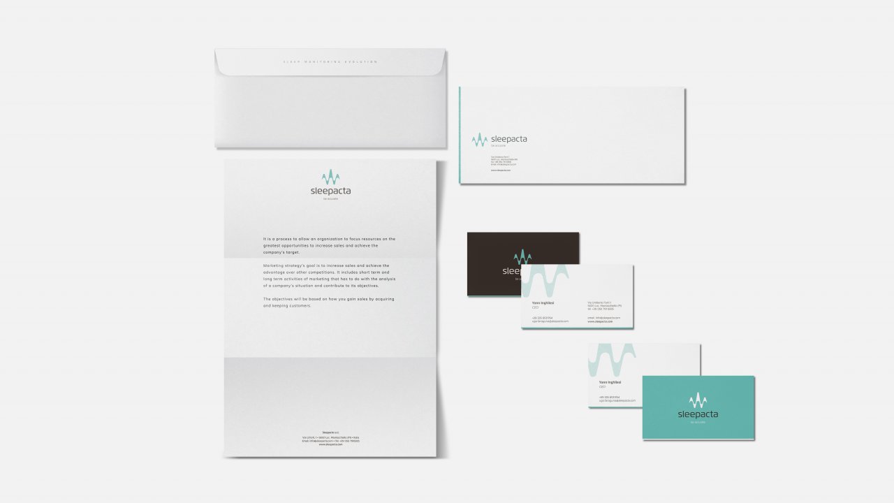
To achieve this goal, we managed every aspect of corporate communication: from strategic repositioning to the creation of new content supporting the brand narrative, from brand design to the development of a new website, and from the redesign to the production of all communication tools.
The client
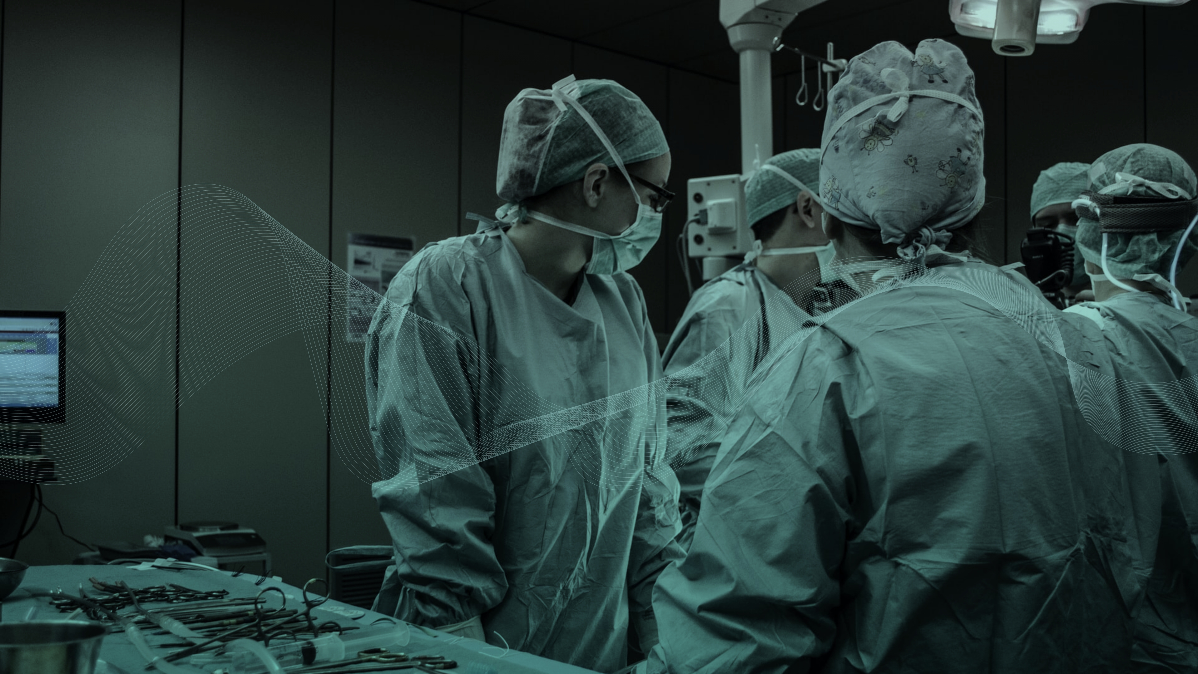
SleepActa, founded as a spin-off startup of the University of Pisa, is now a structured company drawing on the expertise of a team of researchers, physicians and engineers specialized in the study of sleep in relation to people’s health and well-being.
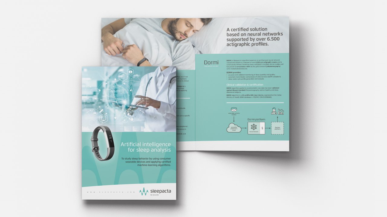
With the aim of simplifying sleep measurement through new large-scale screening techniques and innovative technologies, SleepActa has developed a revolutionary, validated and certified artificial intelligence algorithm. This system enables the collection of patients’ physiological parameters through simple wearable sensor-based trackers (actigraphs), transforming them into reliable analyses and diagnoses.
An innovative approach that has already achieved results comparable to the “gold standard” of polysomnography — a highly demanding diagnostic test that is also poorly suited to investigating certain widespread and often underestimated disorders, such as chronic insomnia or sleep apnea.

The challenge
Promising to innovate diagnostics starting from the brand image of a university startup was not entirely credible — especially considering the stakeholders SleepActa now addresses. Faced with the need to appear more authoritative and rigorous, we nonetheless chose to preserve the idea of a lean and flexible company, capable of demonstrating the reliability of its scientific and technological approach without losing the dynamism of a research-driven organization.
Below are the two main objectives we focused on:
- Transform the perception of SleepActa from a young startup into a hi-tech company, capable of positioning itself as an ideal technological and scientific partner for hospitals, pharmaceutical companies and Health-tech businesses seeking to enhance their offerings through advanced diagnostic and analytical algorithms.
- Package and present the reliability and ease of use of the new “Dormi” algorithm, highlighting the revolutionary contribution that artificial intelligence algorithms trained on neural networks can bring to the field of diagnostics.
The solutions
As always, the analysis of the company and its competitive landscape was the starting point of a project that then unfolded into a series of activities:
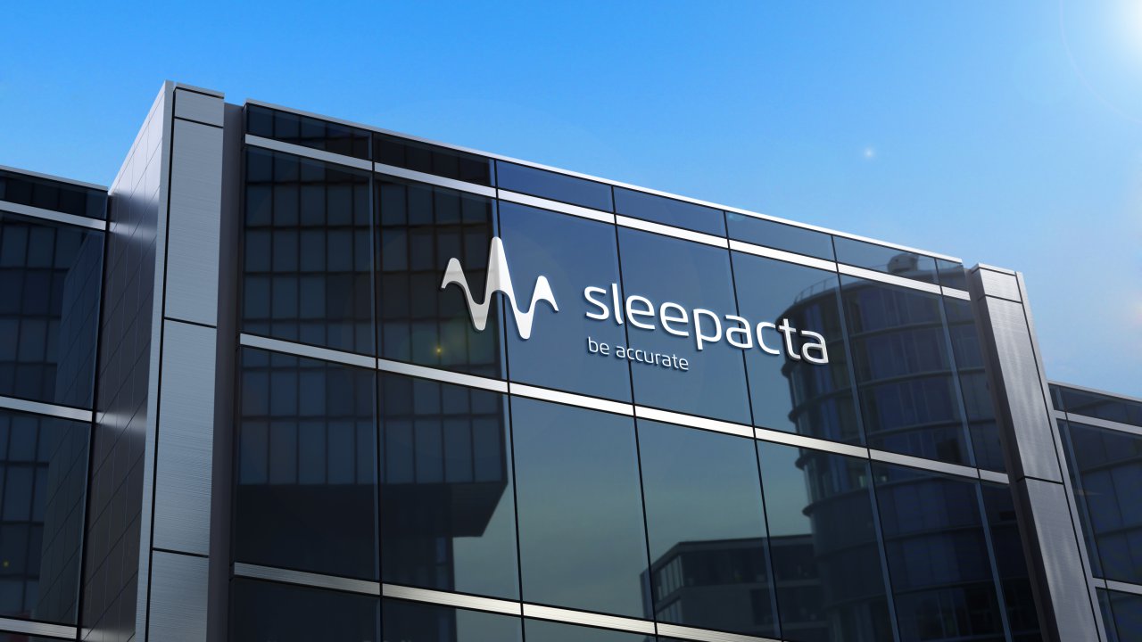
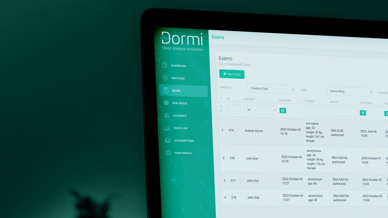
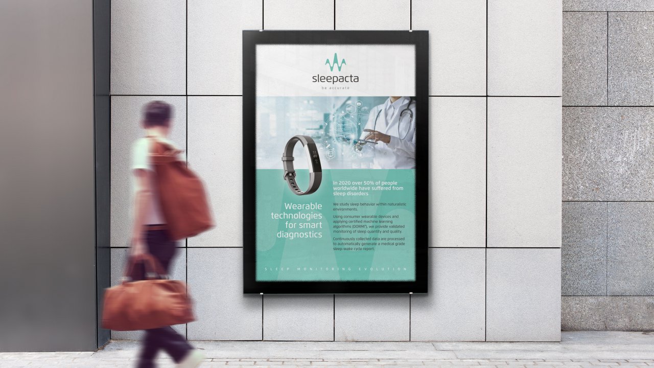
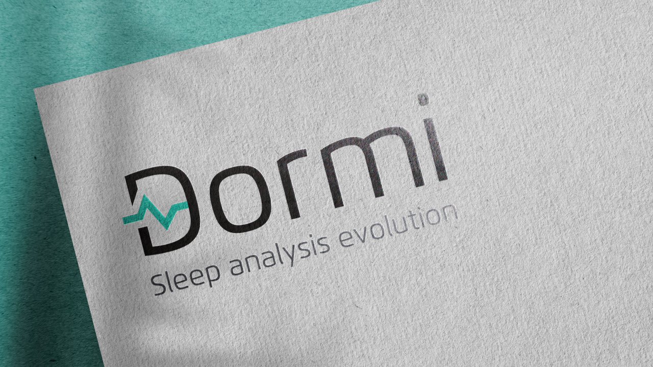
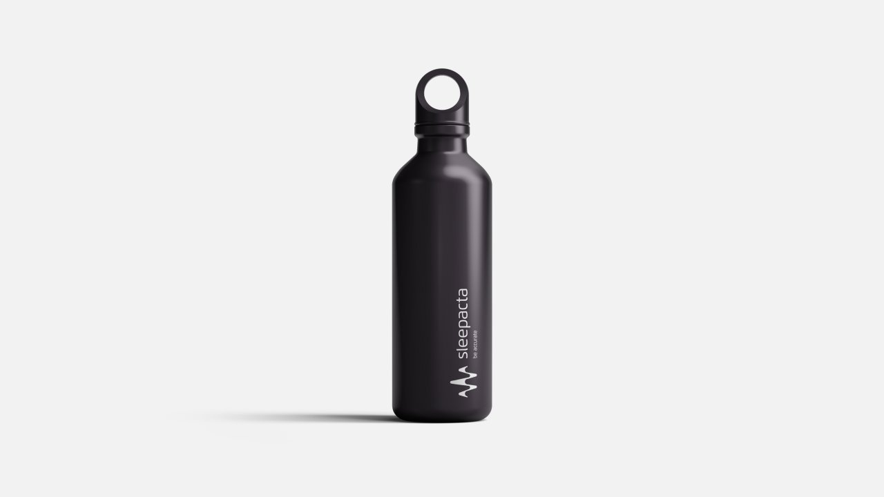
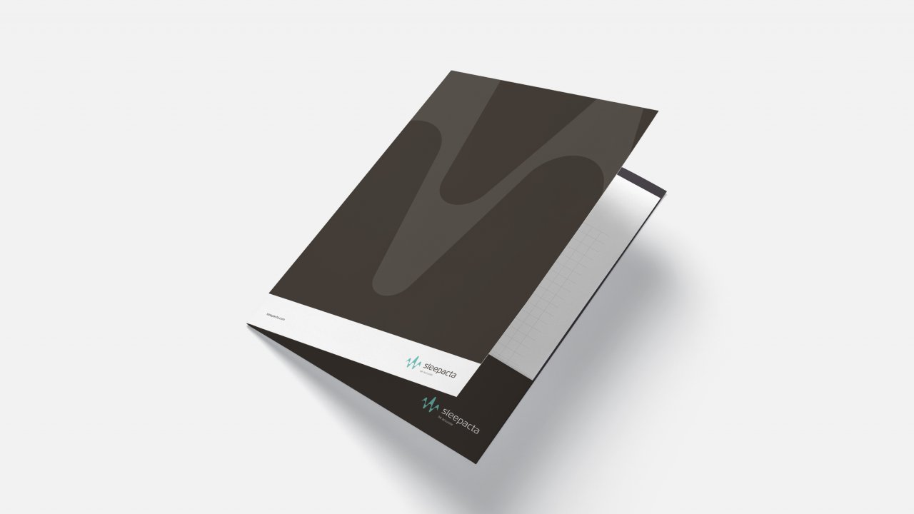
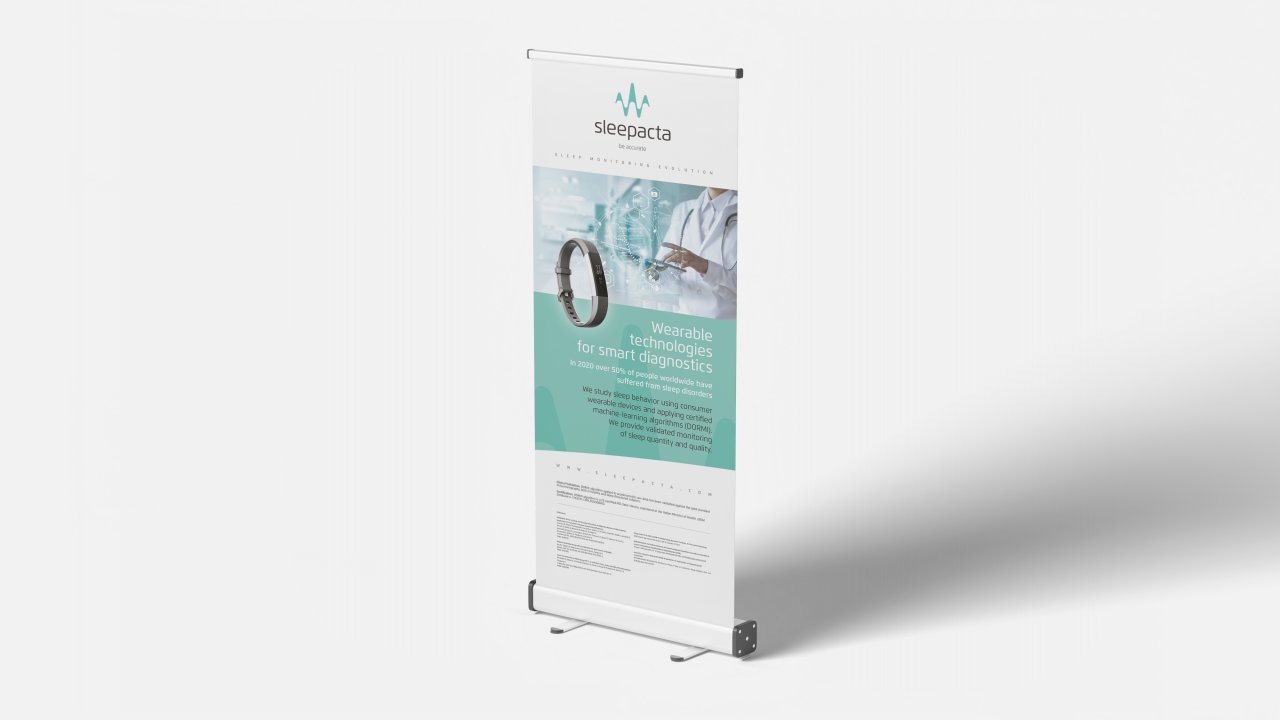
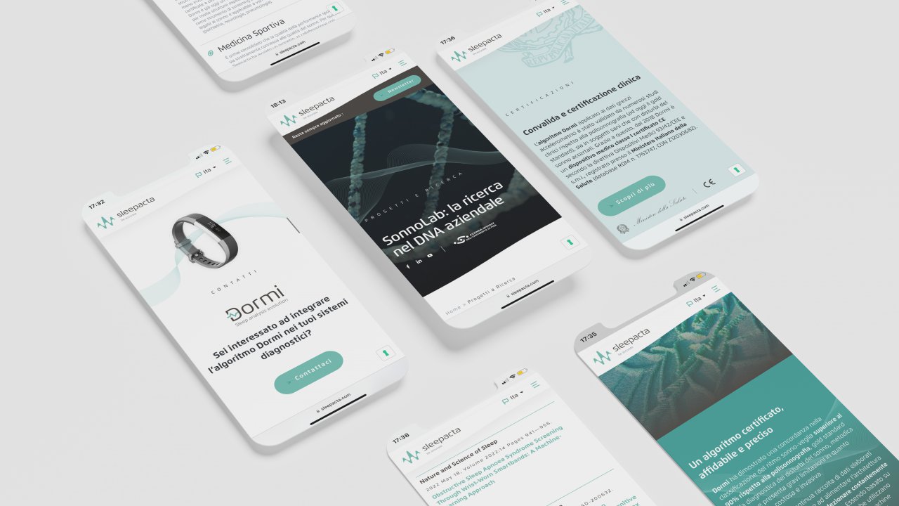
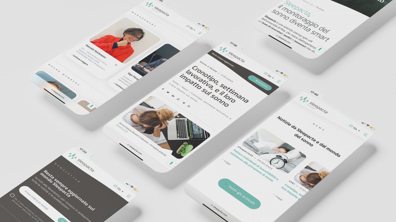
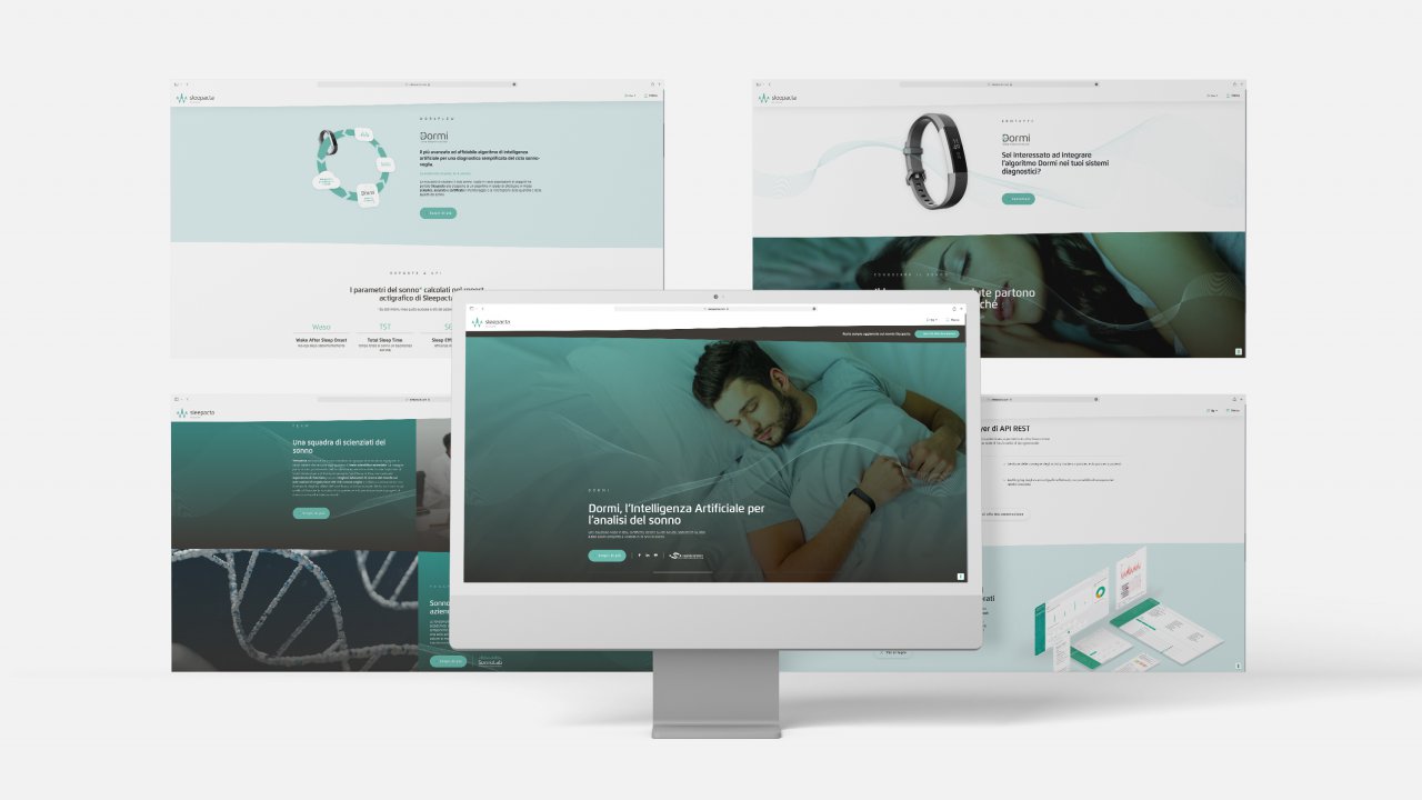
- Repositioning, logo design and corporate identity: to align with the objective of conveying solidity and reliability, we designed the new logo around actigraphy, which represents the scientific output of SleepActa’s algorithms — in other words, what the audience can concretely see and experience. The same concept guided the design framework and all communication tools, giving substance and value to the new payoff “be accurate”, the expression of a strategic positioning centered on the scientific reliability of data interpreted by the algorithms. The design process also involved the first product logotype: DORMI, the revolutionary algorithm driving a true evolution in sleep analysis for diagnostic purposes.
- Content production: beyond design, we rebuilt SleepActa’s brand identity through the development of content aimed at repositioning the brand as an authoritative and innovative player for its various target audiences within the health-tech sector.
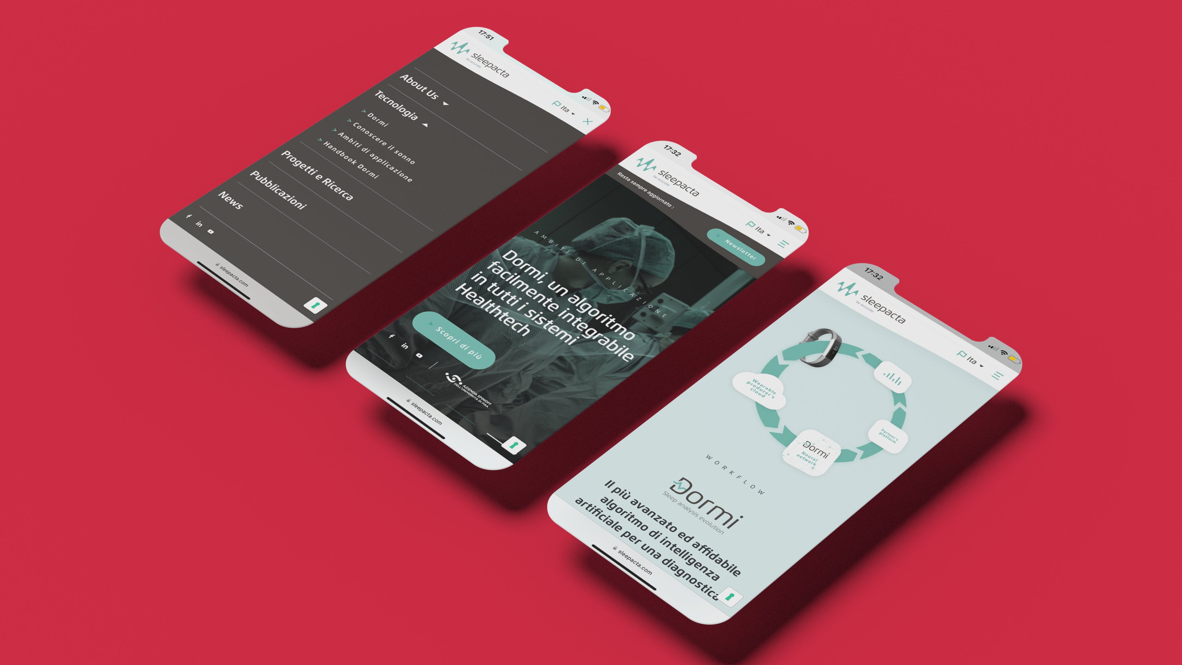
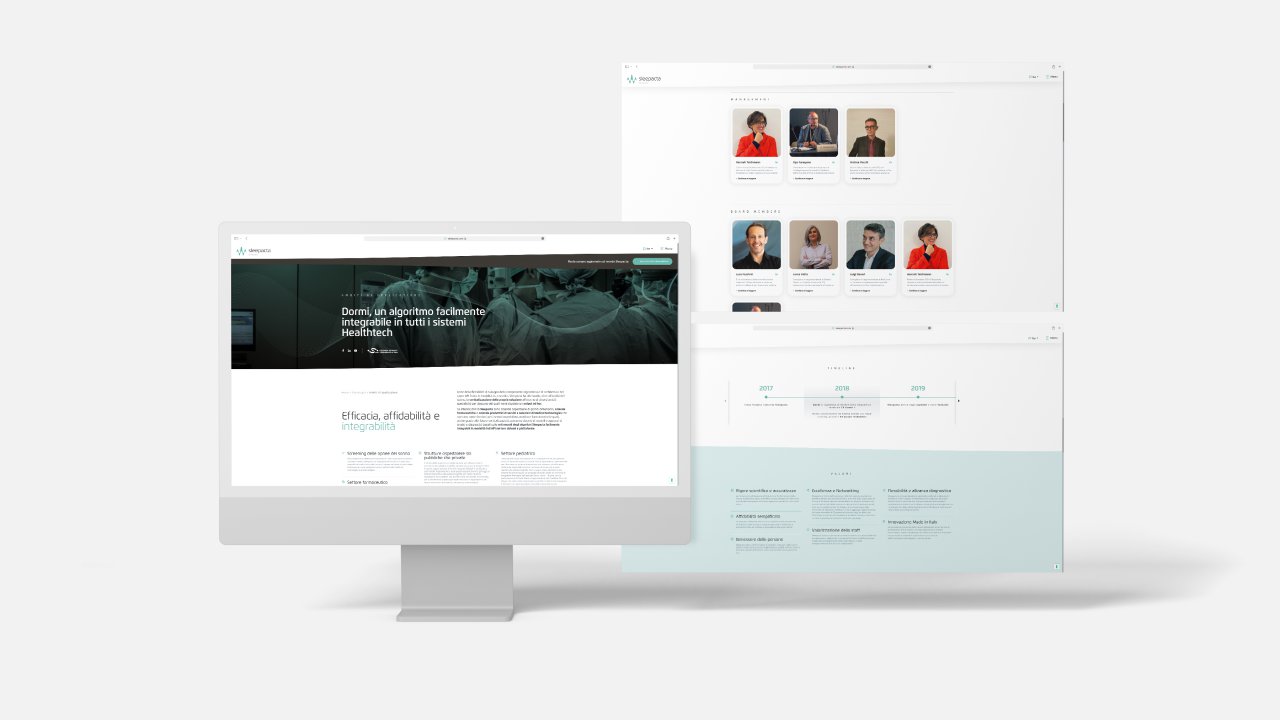
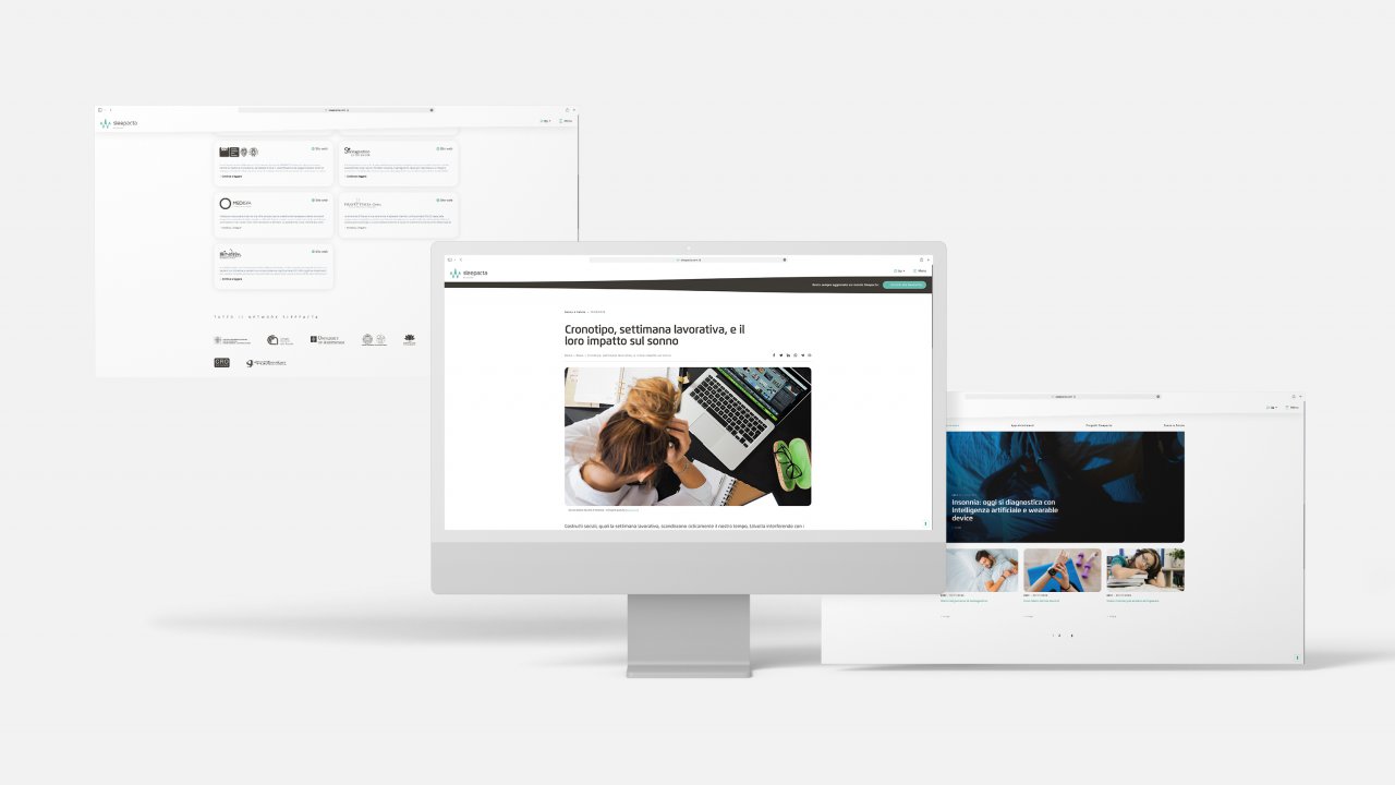
- New website: the brand image project for SleepActa also included the design of a new digital environment, developed from a streamlined and straightforward UX/UI approach focused on highlighting the company’s scientific core.


Get in touch!
Whether it’s well established or still to be built,
we work on the best communication for your brand.